Among the questions people also ask for this search, Google lists a direct one: “What are the best interior paint colors for coastal homes?” Here is the answer from houses rather than from color cards.
Keep the shared rooms in whites and light neutrals, put the soft blues, grays and blue-grays in bedrooms and stair halls, and let natural wood or one dark contrast do the grounding.
That pattern repeats across the beach and island interiors we have painted around Charleston. Which white or which blue depends on each room’s light, and on the coast that light swings from glare to deep porch shade.
Five coastal interiors we have painted
Each of these is on our project pages, with photos and square footage. The pages describe colors by family rather than by paint code, so that is how they appear here.
Sullivan’s Island beach home, 3,855 sq ft
An interior-only job. The walls went crisp white to make the most of the daylight, under wood plank ceilings that were stained rather than painted.
Barn doors were painted gray with black hardware, the staircase pairs natural wood treads with black metal railings, and the kitchen cabinetry and island are white. See the Sullivan’s Island beach home.
Oceanfront home in Wild Dunes, 4,580 sq ft
Color lives in the bedrooms here: blues, soft grays and crisp whites, room by room. The open living areas with the ocean view were kept light, the plank ceilings were stained, and two-story staircases got black railings against white risers. See the oceanfront home in Wild Dunes.
Kiawah Island estate, 5,100 sq ft
The two-story entry and grand staircase were painted in a blue-gray, the one mid-tone in a tall space, next to a natural wood stair with metal railings. Elsewhere, coordinated palettes move from level to level. See the Kiawah Island estate.
Beach house in Wild Dunes, 3,200 sq ft
A whole-house repaint with white trim in the master and guest bedrooms, cathedral ceilings with exposed beams, and the kitchen and dining areas finished to read as one continuous space.
Modern farmhouse in Mount Pleasant, 3,953 sq ft
Painted from construction to completion: white walls under cathedral ceilings, arched doorways, white built-in cabinets with glass doors along a hallway, and black window frames as the contrast. See the modern farmhouse in Mount Pleasant.
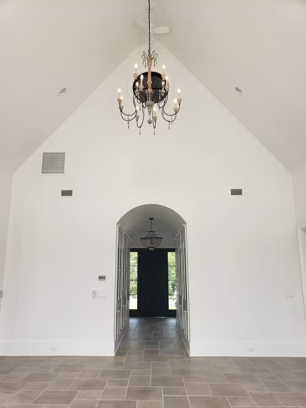
The foyer above shows how far plain white goes in a tall room: the vault, the arch and the chandelier do the decorating, and the stone floor supplies the warmth.
The pattern behind those palettes
Put the five side by side and four habits stand out.
- Light where people gather. Kitchens, living rooms and open plans stay white or close to it.
- Color where people sleep. Blues, grays and blue-grays show up in bedrooms and stair halls, the rooms with fewer windows and less glare.
- Wood does the warming. Stained plank ceilings, wood treads and wood floors keep white rooms from feeling cold, so the white itself can stay clean.
- One dark line. Black railings, black window frames or gray doors give the eye an edge.
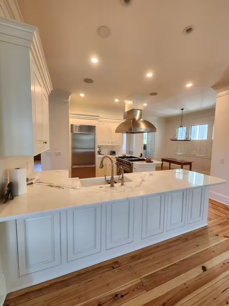
This kitchen, from the photo gallery of our Mary Ellen Drive project in Charleston, is the same idea at kitchen scale: white cabinetry, white island and walls, and a strongly grained pine floor carrying all the color.
Why the same swatch looks different on the coast
In its article on light and color, Sherwin-Williams makes a point every coastal homeowner learns the hard way: one can of paint in two rooms, one dim and one flooded with sun, looks like two different colors.
The paint maker also explains why. Morning sun is warmer and lower and casts a yellowish tone; by midday, daylight turns cooler and bluer. A room facing north gets bluish light all day, and a west-facing room can glow, sometimes too much, in late afternoon.
Coastal houses add two twists. Rooms facing the water take in a lot of reflected glare, and the porches stacked on many raised Lowcountry homes shade the rooms behind them. A soft blue that looked airy at the store can read gray-green behind a deep porch.
Matching the color family to the room
Light reflectance value (LRV) is the number on many swatches that says how much light a color bounces back. Lighter tints have higher values, and Sherwin-Williams suggests them for spaces that don’t get much daylight. Use it as a guide:
- Bright, water-facing rooms: whites and pale neutrals with a little warmth keep glare comfortable; very cool whites can look stark at midday.
- Rooms behind porches or facing north: go a step lighter than you think, or toward warmer undertones, to offset the cool, dim light.
- Bedrooms and stair halls: the place for the blues, grays and blue-grays the coastal look is known for.
- Bathrooms: color matters less than the product. Sherwin-Williams points to ventilation and a mildew-resistant primer and paint where moisture is the problem.
Sheen changes the color too
Sherwin-Williams notes that the higher the gloss, the more light a surface reflects, so the same color in satin can read lighter than in matte. If you are deciding between eggshell and matte for a bright room, our guide to the best paint finish for walls compares the measured gloss numbers.
Inside and outside, one house
A coastal house is seen through its windows and porches, so the interior and exterior palettes meet at every open door.
If you are repainting both, choose them together. The outside of several of these houses, like the soft sage green porches on Kiawah, is covered in our guide to exterior paint colors for coastal homes.
Testing before you commit
Paint two large samples of each finalist on different walls of the same room, including the darkest corner. Look at them in the morning, at midday and at night under your own bulbs, the moments Sherwin-Williams singles out: early light, midday and evening under artificial light. Pick the one you still like in all three.
What to send us before a color consultation
If you’d like a second opinion, a few photos save a lot of guessing:
- each room in morning light and again in late afternoon, taken without flash;
- which way the main windows face, and whether a porch shades them;
- what stays: floors, wood ceilings, stone, cabinets, large furniture;
- any colors you already love or already ruled out.
Color consultation comes with our interior house painting projects, from single rooms to whole homes. Send the photos and ask for a free interior estimate.