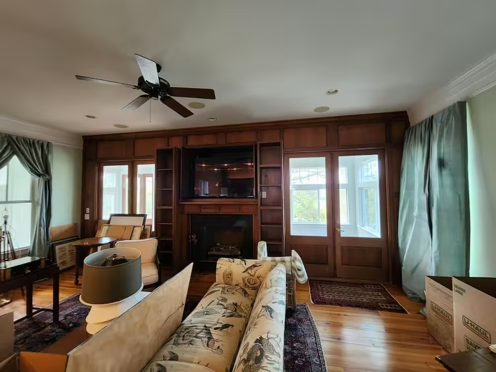
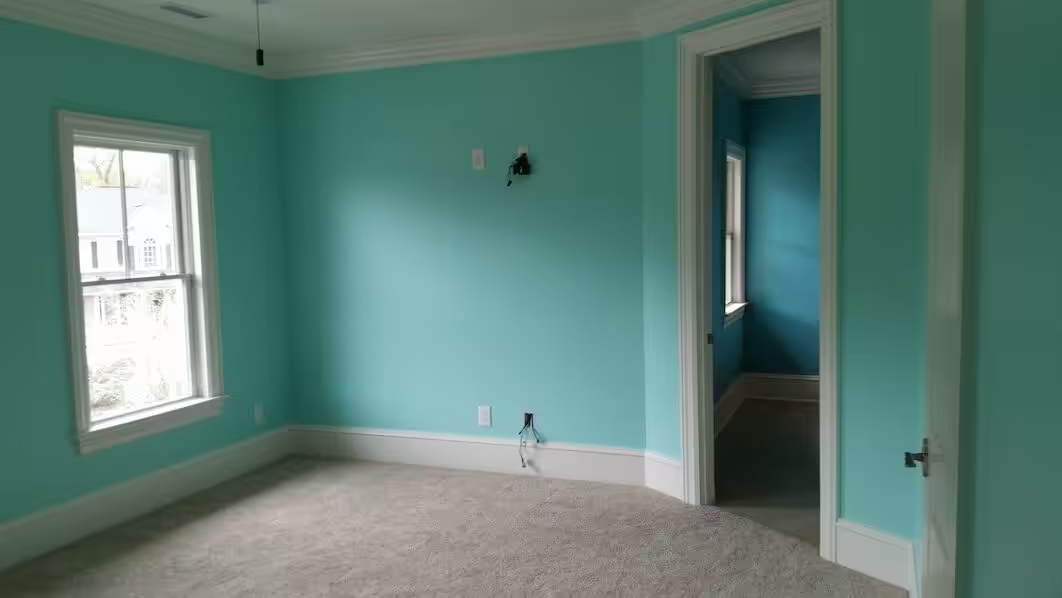
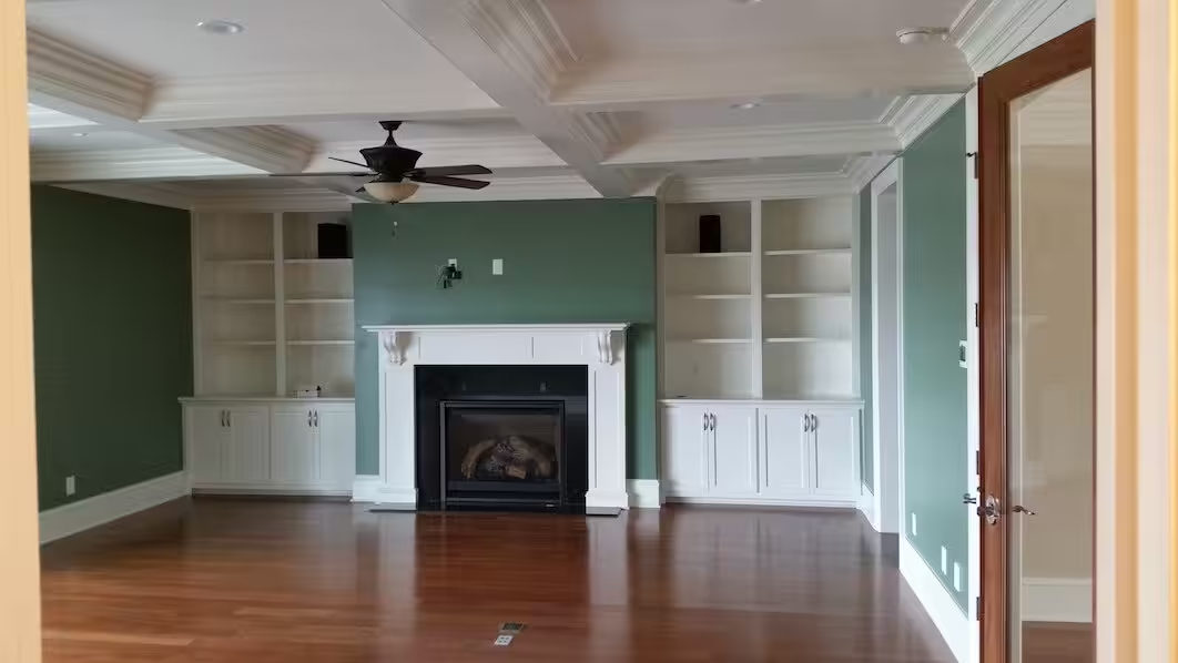
A classic mistake is choosing from a two-inch chip under the store’s lights.
To choose interior paint colors that work, start from what in the room will not change, read which way the light comes in, decide how many colors you need, and only then test large samples on your own walls at different times of day. The chip comes last, not first.
The checklist below follows that order. Each step has a short note on why it matters, with examples from interiors on our own project pages.
1. List what stays in the room
Floors, countertops, tile, stained wood trim, a fireplace surround and the large furniture you are keeping are your fixed colors. Paint is the cheapest thing in the room to change, so it adapts to them, not the other way around.
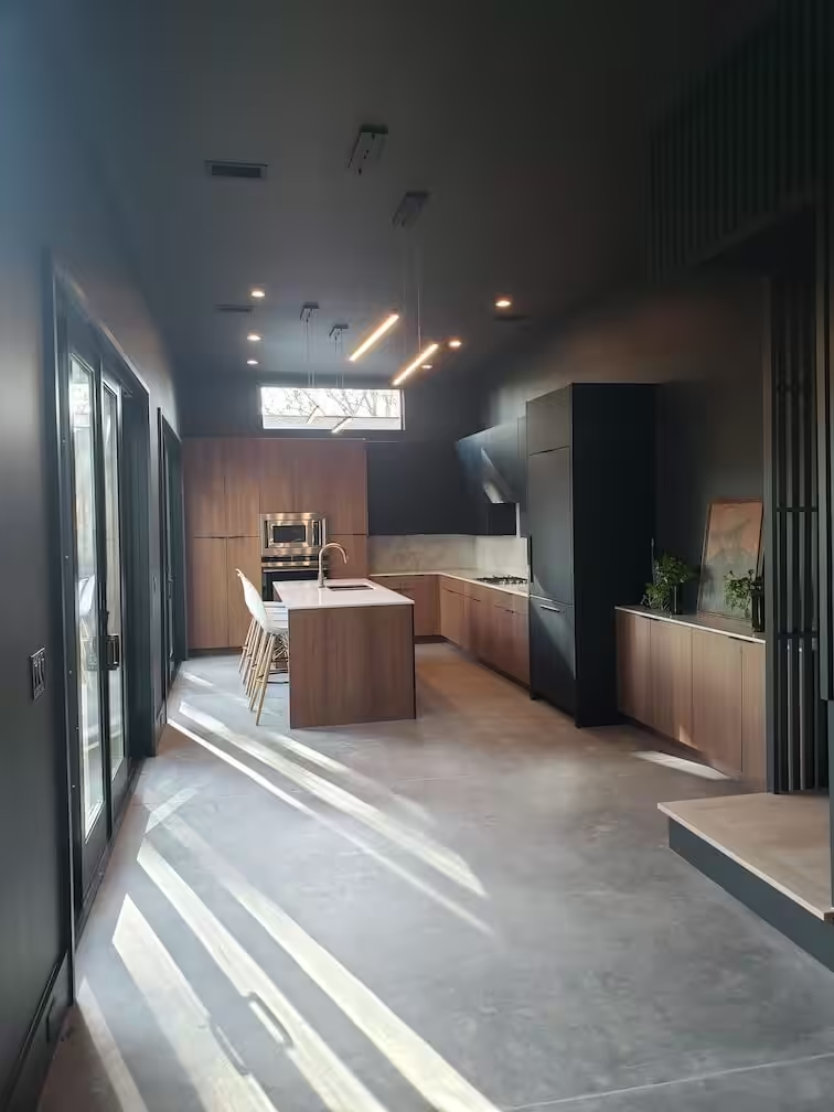
In this downtown Charleston townhouse, the wood cabinetry and the concrete floor are the fixed elements, and the walls and ceiling around them are painted deep charcoal, which makes the wood the warmest thing in the room and lets the floor read as pale.
2. Read the light by compass direction
The same can of paint looks different on each side of a house. Sherwin-Williams’ guide “The Play of Light and Color” describes daylight this way:
| Windows face | Light | When | What it does to color |
|---|---|---|---|
| North | Cool, bluish | All day | Warm colors help offset the blue cast |
| East | Warm, yellow | Before noon | Rooms look warm in the morning, flatter by evening |
| West | Warm, orange-red | After noon | Warm colors can turn intensely vivid in late afternoon |
| South | Warm, orange-yellow | All day | Strong midday sun can wash colors out |
The same guide gives a concrete case: a warm orange-red that brightens a north-facing room can become overwhelming in a west-facing one by late afternoon. Note which rooms you use at which hour. A dining room used only at night barely needs the daylight test.
3. Check the bulbs you actually use
Evening color comes from your fixtures, not the sun. Sherwin-Williams notes that incandescent light intensifies warm colors and dulls cool ones, while fluorescent light amplifies blues and greens and mutes warm colors. Whatever bulbs are in the room now, those are the ones to test under. If you plan to change them, change them before you choose.
4. Decide how light or dark each wall should be
Every color has a light reflectance value (LRV): the share of light it bounces back.
Lighter tints have higher values than darker ones, and higher sheens reflect more light and tend to enrich a color, according to the same Sherwin-Williams guide. Its example for a dim alcove off a main room: use a lighter tint of the main color, so the nook brightens without breaking the flow.
Sheen is a separate decision with its own trade-offs for cleaning and touch-ups; our guide to the best paint finish for walls compares them room by room.
5. Count your colors before you count rooms
Designers often quote a 60-30-10 split: one dominant color, a secondary one and a small accent. It is a rule of thumb, not a standard. Painters think in a different count, and it is worth knowing because it shapes the estimate.
The Painting Contractors Association’s Standard P3 sorts interior work into color levels:
- Level I: one color for the whole project;
- Level II: up to two colors, one per room;
- Level III: three or more colors within a room, one per surface;
- Level IV: unlimited colors and special finishes.
The standard limits Levels I to III to off-whites and pastels; pure white, mid-tones and deep tones put an interior job in Level IV. Its stated purpose is to show that the number and placement of colors affect project cost.
In practice, write a short schedule before you ask for estimates: room, surface (walls, ceiling, trim, doors), color and sheen. Two painters pricing the same schedule are pricing the same job.
6. Plan how rooms read from each other
In an open plan, you see several walls at once, so they behave as one composition.
The downtown townhouse above kept a single dark palette across its levels; the project page describes coordinated dark tones that carry from floor to floor. A lighter house can follow the same idea with one wall color throughout and contrast saved for doors or a single room you close off.
7. Test samples the way the trade does
The PCA’s Standard P5 describes how contractors approve finishes on larger projects: a sample area of about 100 square feet, prepared with the full coating system, and only after the permanent lighting, heating and air conditioning are installed and running. Nobody needs 100 square feet in a bedroom, but the logic scales down:
- paint samples large, a couple of feet on each side, not a chip taped to the wall;
- put one on the brightest wall and one on the darkest;
- apply two coats, the same as the finished wall will get;
- look in the morning, at midday, after dark with the lamps on, and once more the next day;
- keep the samples away from the old color’s edge, which skews how you see them.
Deep colors also take more coats on the actual walls, which we cover in how many coats of paint interior walls need.
8. If you are going dark, plan for what dark demands
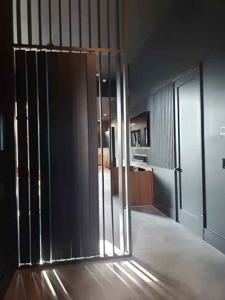
Dark rooms like this hallway in the same townhouse depend on clean lines where colors meet, because every wobble at the ceiling or trim shows. Our interior page lists dark colors among the jobs that need careful cutting-in.
Touch-ups are the other thing to plan. The PCA’s Standard P24 notes that a spot repair stays visible from an angle, and that it shows more as the sheen goes up. Keep a labeled quart of each color from the job for repairs.
If your house sits near the water and you want palettes rather than method, our article on interior paint colors for coastal homes picks up from here.
One rule worth keeping
If a color only looks right at one hour of the day, it is the wrong color for a room you use all day. Choose the sample that still looks right at the hour you spend the most time in the room, under the light you actually have.
VMS Home Painting offers interior painting with color consultation for Charleston-area homes, from a single room to the whole house. Bring your color schedule, or your short list of samples, and book a free interior estimate.